The Los Angeles Auto Show tends to be a showcase for hybrids and green-car technology, but it has a different feel this year. Instead of new hybrids or electric cars, showgoers will be treated to everything from new high-performance sedans to new crossovers to new convertibles.
More 2015 Los Angeles Auto Show Coverage
There was plenty to see, and Cars.com editors Aaron Bragman, Joe Bruzek, Joe Wiesenfelder and Mike Hanley spent a few days roaming the Los Angeles Convention center taking it all in. They weigh in below with their thoughts on what flashed and what flopped under the bright auto show lights.
2017 Alfa Romeo Giulia
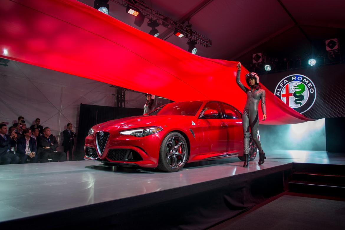
2017 Alfa Romeo Giulia; Cars.com photo by Steven Pham
Aaron Bragman: Winner
I can overlook the fact that, from the outside, it looks like a BMW 3 Series on steroids 'cuz from the inside it's fantastic. Uniquely styled with an emphasis on serious sporting ability, everything from the carbon fiber-trimmed seats to the thin-rim suede steering wheel screams "racecar." The details are awesome too — the green, white and red stitching on one version was wicked cool. I can't wait to drive this thing.
Joe Bruzek: Winner
So much win. The Giulia has a menacing look that's pure business, the business of high-performance with a huge rear diffuser, carbon fiber front and rear spoilers, and optional carbon-ceramic brakes. The car's stance is hunkered down and straight disgusting — in a good way.
Joe Wiesenfelder: Winner
I'm not seeing a lot of BMW here; to the contrary, any new model that looks distinctive without being ugly is a winner — especially when it has a sick rear diffuser like this one (and I hope I've used the slang "sick" appropriately here). The specs look great, putting it high on my want-to-drive list. As an aside, the ad campaign poking the German competition is a winner. Who doesn't like German shepherd puppies?
Mike Hanley: Winner
Alfa Romeo showed the high-performance Quadrifoglio version of the Giulia, and from its racing-style bucket seats to its muscular styling the brand has made it abundantly clear it's not messing around as it works to reestablish itself in the U.S. BMW, Cadillac and Mercedes should take this thing seriously — despite the cute four-leaf-clover badges on the front fenders. It doesn't appear to need any luck.
2017 Buick LaCrosse
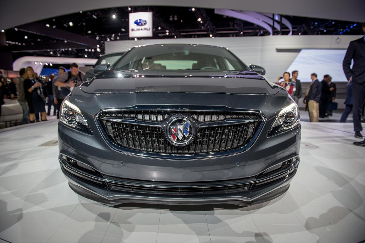
2017 Buick LaCrosse; Cars.com photo by Steven Pham
AB: Winner
It's not wildly styled, it's not outrageously garish, it has no odd Predator-style grilles or faux air inlets or even much chrome. All the new LaCrosse has going for it is clean, stylish, flowing lines, inside and out. This is simply a lovely car, and while it doesn't look exactly like the gorgeous Avenir concept car, it doesn't sit on that car's rear-wheel-drive platform, necessitating some changes. Even on the inside, the LaCrosse is elegant and modern. I'd choose this over an Acura RLX any day.
JB: Winner
Buick's new LaCrosse is a pleasant surprise and great start for the brand's new styling direction. It's classy, simple and doesn't use gaudy chrome accents as a crutch for a boring design. The interior is equally elegant and hasn't gone too techy as the multimedia system still uses knobs for volume and tuning — please keep that trend going, Buick.
JW: Loser
This, ladies and gentlemen, is why it's risky for automakers to build stunning concept cars and tie them too closely to upcoming products. It's decent looking, but it's no Avenir, and all I can see is the gap between the hood and the fascia above the grille. The backseat seems roomy, but it's too close to the floor. As someone who never feels crowded by center consoles (that would be my colleague's Kelsey Mays' thing), trust me when I say this one is preposterously high and wide. Porsche would blush.
MH: Loser
The LaCrosse's sleek, low-slung styling is appealing, but I can't get past the new front end, which Buick touts as the new face of the brand. There's nothing about the wide grille that says luxury; remove the Buick badge and it looks like something from a mainstream brand. Buick said the spectacular Avenir concept car inspired the design but, like Wiesenfelder, I'm not seeing enough of it here.
2017 Cadillac XT5
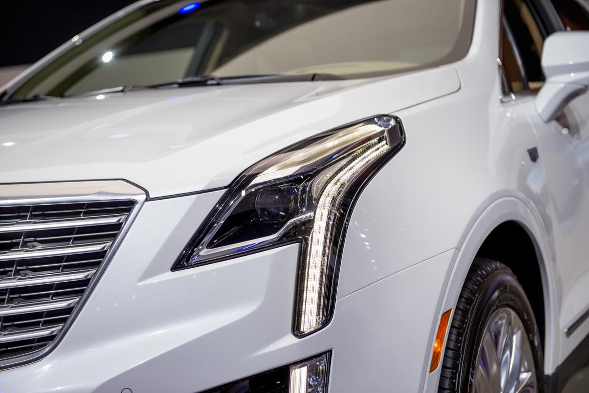
2017 Cadillac XT5; Cars.com photo by Steven Pham
AB: Winner
Another styling win from GM. Pictures don't really do it justice; the XT5 (I hate the new Cadillac naming convention) is sleek, well-proportioned and fits in perfectly with the rest of the attractive Cadillac lineup. My only quibbles: Cadillac is still using touch-sensitive controls for things like audio and climate control, and there's a real lack of backseat headroom due to the panoramic roof.
JB: Loser
Like Bragman, backseat headroom was a real issue for me; I'm 6 feet tall and had to slouch to avoid hitting the roof. I commend Cadillac for its light-weighting efforts (the XT5 is 278 pounds lighter than the outgoing SRX), but it's a pretty standard update without any features or styling elements that really pop.
JW: Winner
Cadillac definitely got the styling right on this one. I'm particularly pleased the automaker knocked the peaks off the taillight lenses yet retained their overall three-dimensionality. (The bat ears on the erstwhile SRX, a homage to Cadillac's tail-fin history, prove that winky-wink doesn't always translate to attractive.) The interior is at its best with Maple Sugar accents and semigloss wood trim, a classic approach that outdoes the contemporary carbon-fiber treatment also on display here.
MH: Loser
Cadillac has been pushing the bounds of luxury styling in recent years, but not with the new XT5 crossover; there's a blandness to the exterior that left me underwhelmed. Interior materials quality impresses, but some of the interfaces are a letdown, particularly the touch-sensitive slider for stereo volume. Has Cadillac learned nothing from Lincoln's failed experiment with this technology?
2017 Fiat 124 Spider
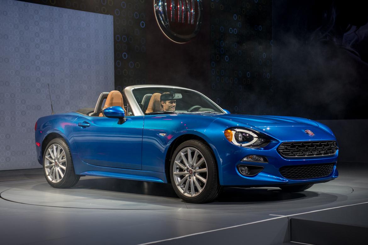
2017 Fiat 124 Spider; Cars.com photo by Steven Pham
AB: Loser
I do not like fusion cuisine. No Kogi tacos, no barbecued chicken pizza. No Italian-flavored Japanese roadsters. I recognize that crafting a low-volume sports car from scratch is expensive, and modifying one that already exists is only marginally less so, but I don't think Fiat went far enough in creating the 124 Spider from the Mazda MX-5 Miata. It's great that it has a Fiat engine, but it has a Miata interior. Given how different the Infiniti QX30 and Mercedes-Benz GLA-Class platform mates are, I think Fiat could have done more.
JB: Loser
The Fiat 124 Spider is one of those cars you hope looks better in person than it does in photos. It doesn't. Fiat-izing the MX-5 Miata is a bold move considering Mazda's designers did a near-perfect job in the first place. There really isn't any way to improve on that with just a casual restyling.
JW: Winner
As a onetime Fiat Spider owner, I'd prefer to see a homegrown car, but at least the Miata is a no-lose donor vehicle. I'd say loser but for one thing: The engine is different, and though the Miata's is great, with a broad torque band, the Fiat has 36 pounds-feet (24 percent) more. I've found that engine to have classic turbo lag in other Fiats, but the peak is a claimed 2,500 rpm versus the Miata's 4,600 rpm. We'll see.
MH: Winner
With its slit-style headlights and gaping grille, I've tolerated more than loved the face of the redesigned Mazda MX-5 Miata. That's probably why I like the more traditional appearance of the 124 Spider with its more slender upper and lower grilles, and upright front end. A turbocharged four-cylinder under the hood is pretty appealing too.
2017 Ford Escape
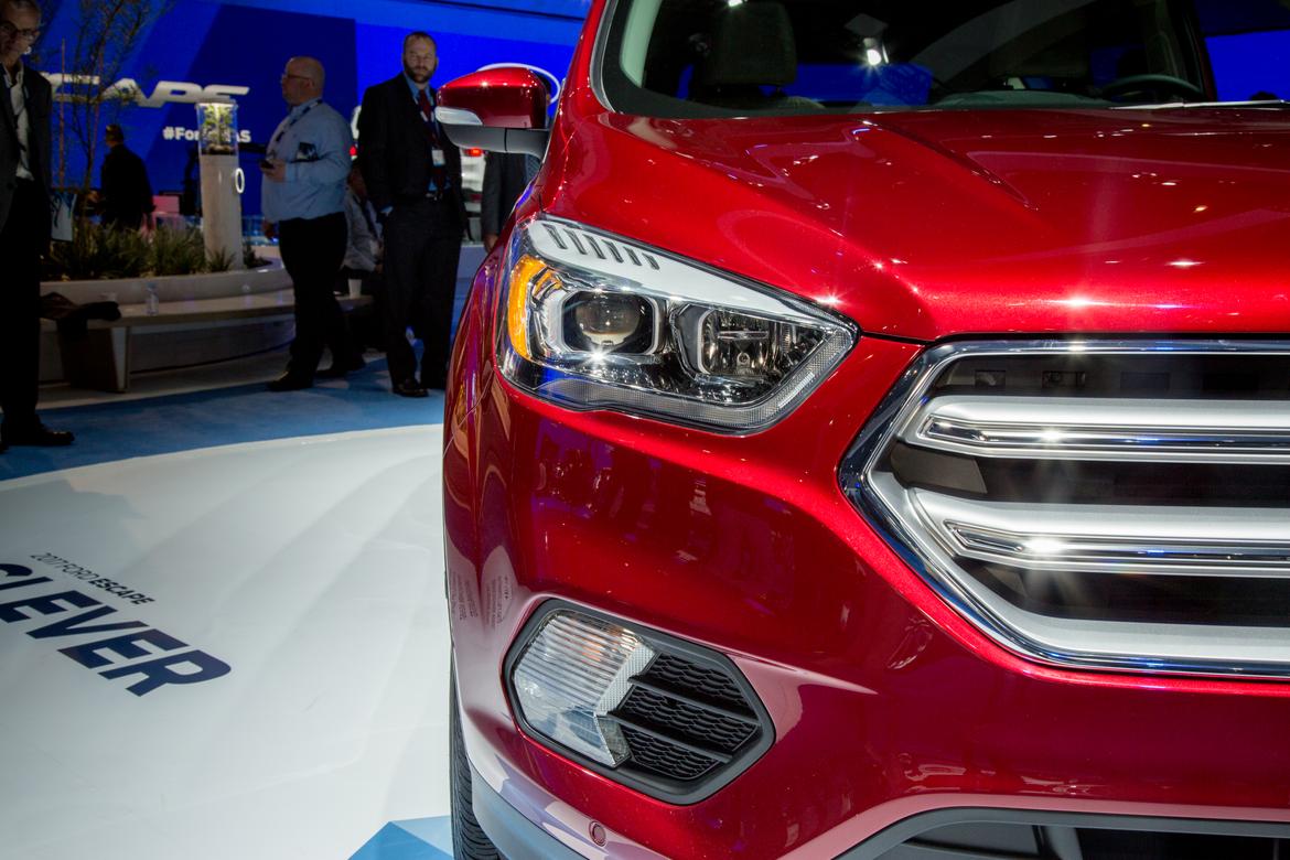
2017 Ford Escape; Cars.com photo by Angela Conners
AB: Winner
This looks pretty much as we expected: like a baby Ford Edge. Thing is, the new Edge looks and drives quite well, so this isn't necessarily a bad thing. It also returns an element of truckiness to the Escape, something the SUV lost when it went from its second to third generation. And a return to real buttons is something that should always be applauded.
JB: Loser
Ford didn't get too crazy with the new Escape, and there's still a lot of the old design in the profile as well as the interior. It's fine that Ford didn't mess with the huge cargo opening and low cargo load-in height, but I think it missed an opportunity to tweak the interior with a more comfortable backseat (it's narrow even for a skinny guy like me) and replace some of the more unsightly interior materials (like the top of the media screen) with higher-quality pieces.
JW: Winner
The styling is a little bland (is there a sale on hexagonal grilles across the industry?), but the previous gen's once-bold styling had definitely gone stale. Nothing's very exciting about this vehicle, but neither was there much wrong with it — except one thing: the touch-sensitive panels. The switch to real buttons earns an automatic winner. That's how loathsome we found them — and how hard we hammered Ford. They've earned it.
MH: Loser
The Escape's new front styling aligns it with the larger Edge, but it's not a particularly exciting design. The best thing about it is that a front license plate will no longer wreck the design theme like it did on the previous Escape.
2016 Honda Civic Coupe
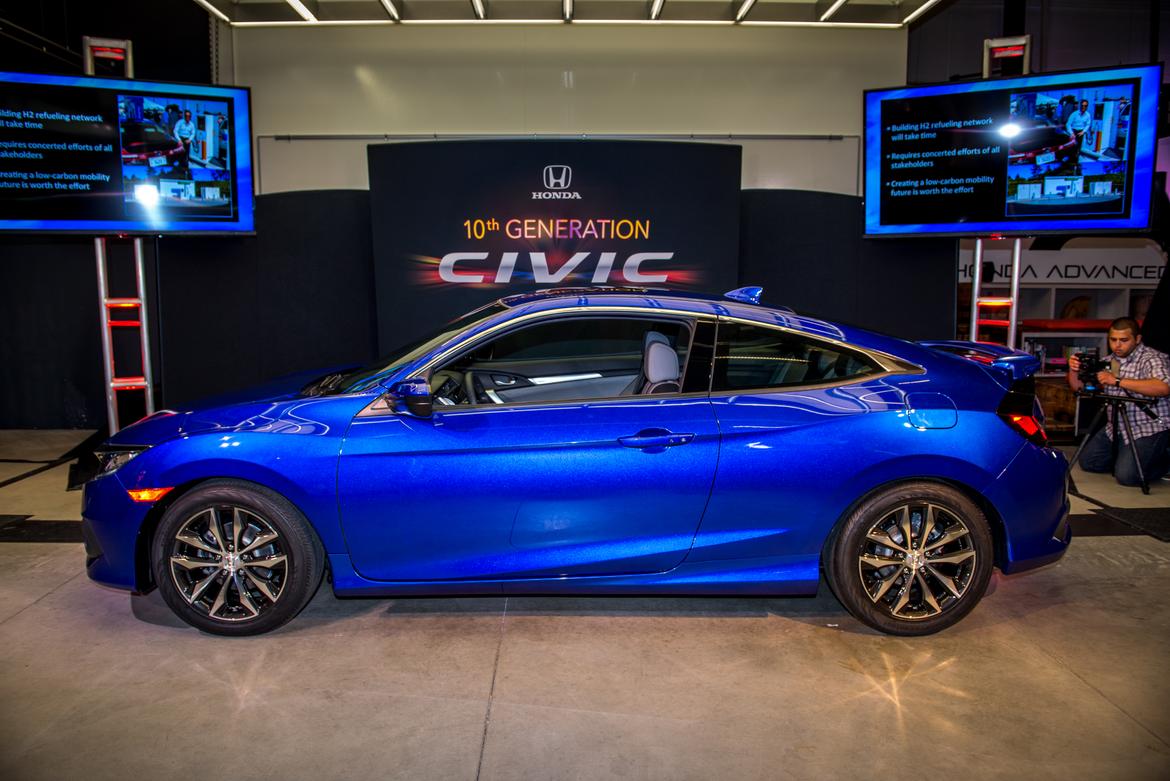
2016 Honda Civic Coupe; Cars.com photo by Steven Pham
AB: Winner
The new Civic is a knockout, in sedan or coupe form, though I think I would actually give the nod to the sedan with its longer tail and better proportions. But kudos to Honda for actually taking a chance and letting the designers get back to making appealing-looking cars. That the new Civic coupe looks quite a lot like the concept we saw earlier this year is a good thing indeed.
JB: Winner
In a segment where there seems to be a lot of similar designs, the Civic stands out as purely unique, and that carries over to the new coupe. The interior quality is top-notch for the class, and visibility is surprisingly good for a small coupe.
JW: Winner
The first-generation Hyundai Tiburon accent line on the haunches and the odd protrusions on the rear end give me pause, but I'm going to go winner on this one because Honda got the front end right, and because I know how good the sedan is, having driven it. Coupes attract a particular type of cat, and this one's styling could prove to be the meow.
MH: Winner
The new Civic coupe stays remarkably true to the concept version we saw at the 2015 New York International Auto Show, and it carries to production more extreme features like the thin strip of lights on the trunk lid that meet the taillights. I can't wait to see what the forthcoming performance variants look like.
2017 Hyundai Elantra
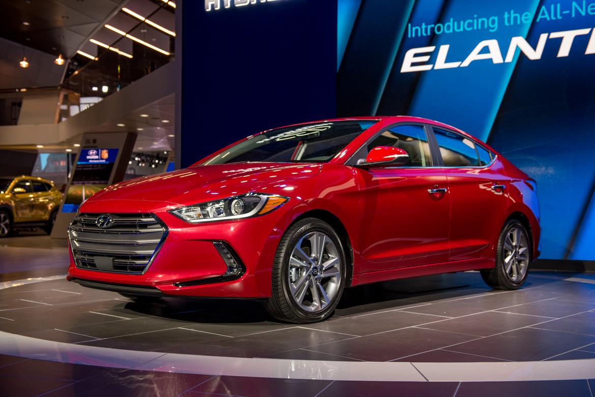
2017 Hyundai Elantra; Cars.com photo by Steven Pham
AB: Loser
It's a new Ford Fusion. No, really, look at it — it's a new Ford Fusion! How could Hyundai designers not actually step back and see that the thing is almost a dead ringer for Ford's midsize sedan? Imitation may be the sincerest form of flattery, but this is practically plagiarism. The clincher for loser status: The interior has been noticeably cheapened and no longer feels competitive.
JB: Winner
Hyundai may have borrowed design aspects from other automakers, but it at least borrowed the right ones on the new Elantra. The styling is handsome and cleaner than before even though the look is less playful and more premium. Then consider all of the safety features, including available pedestrian warning, and it's a stout little package.
JW: Loser
Now I know how lovers of the previous-generation Sonata (of which I wasn't one) felt when Hyundai made the 2015 more conservative (fine by me). Where the old Sonata was certainly distinctive, the current Elantra sedan is much more: one of the best, most cohesive designs on the road today. The 2017 redesign wipes that out. I'm sure it will be a better car overall, but I've come to expect a lot from Hyundai. A victim of its own success, the brand will have to work harder to impress me.
MH: Winner
There's more than a little bit of Audi styling in the redesigned Elantra's front end, but for a compact economy car, that's not a bad thing. The sedan has a trim, athletic look, and the upturned trunk lid is a nice way to finish the design. Like Bragman said, materials quality could be better, but there's a lot to like here.
2017 Infiniti QX30
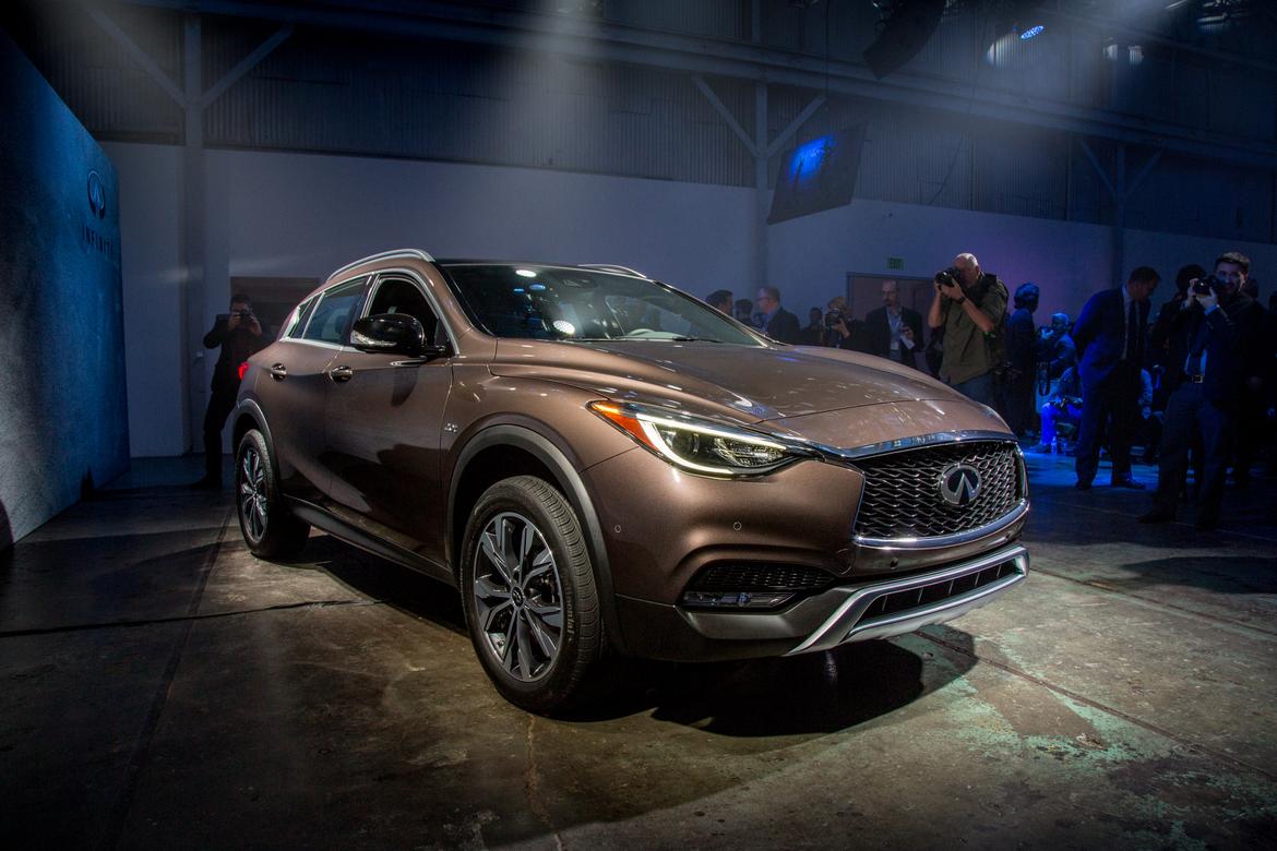
2017 Infiniti QX30; Cars.com photo by Angela Conners
AB: Winner
Who knew you could create something so completely different looking inside and out from the bones of a Mercedes-Benz GLA? Both companies spent some coin here creating totally different looks for these two cars, and I have to say this is perhaps the most appealing Infiniti in recent memory. Yes, there's some obvious parts sharing in the interior, but not nearly as much as I'd expected.
JB: Winner
No other Infiniti is as distinctive and uniquely styled as the QX30, well, in a good way at least (sorry, QX80). The QX30 is in a great position to bring attention to the brand, and hopefully the car drives as well as it looks — a legitimate concern since it's based on the harsh-riding GLA-Class.
JW: Winner
A GLA-Class without the weird styling and with better outward visibility? Sign me up! The backseat is roomier than in the old EX37 (a fun-to-drive favorite), yet the QX30 remains mostly what that model had already been rather than aping every compact luxury SUV in the class. Bravo.
MH: Loser
The QX30 looks more like a sporty hatchback than a small SUV, and while I like its style, a low roofline significantly compromises headroom to the point where I wouldn't want to ride in it for long. It's also a little disorienting to see so many Mercedes bits in the cabin, a reflection of its joint development with the German brand.
2017 Kia Sportage
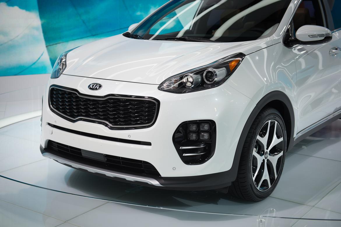
2017 Kia Sportage; Cars.com photo by Steven Pham
AB: Winner
Wow, talk about a poor man's Cayenne. The new Sportage looks fantastic inside and out. There's a lot of Porsche influence in this design, from the quad foglights to the shape of the dashboard vents. Combine it with the zippy turbocharged engine that already made the Sportage one of the more fun-to-drive Kias and this just looks dynamite.
JB: Loser
Porsche Cayenne? More like a goldfish with an overbite. I'm just not seeing anything attractive in the new Sportage's front end. The inside is nicely appointed but there's an overload of similarly shaped buttons on the center dashboard with four tiers of confusing rows. At least there are physical buttons though.
JW: Winner
The styling is challenging, but something is much more important to me: This twin of the Hyundai Tucson uses neither the 1.6-liter engine nor the seven-speed dual-clutch transmission, a combination that fails in that model, plaguing all but its base trim level. The Sportage uses two different engines and a conventional six-speed across the board. Win.
MH: Loser
There's a lot of anger in the face of the new Sportage — all I see when I look at it is Bane from "The Dark Knight Rises" — and I'm with Bruzek on the button layout in the middle of the dash; it's not especially intuitive. The Sportage arrives at the right time as car shoppers are clamoring for SUVs, but I think the styling is going to make some keep their distance.
2017 Land Rover Range Rover Evoque Convertible
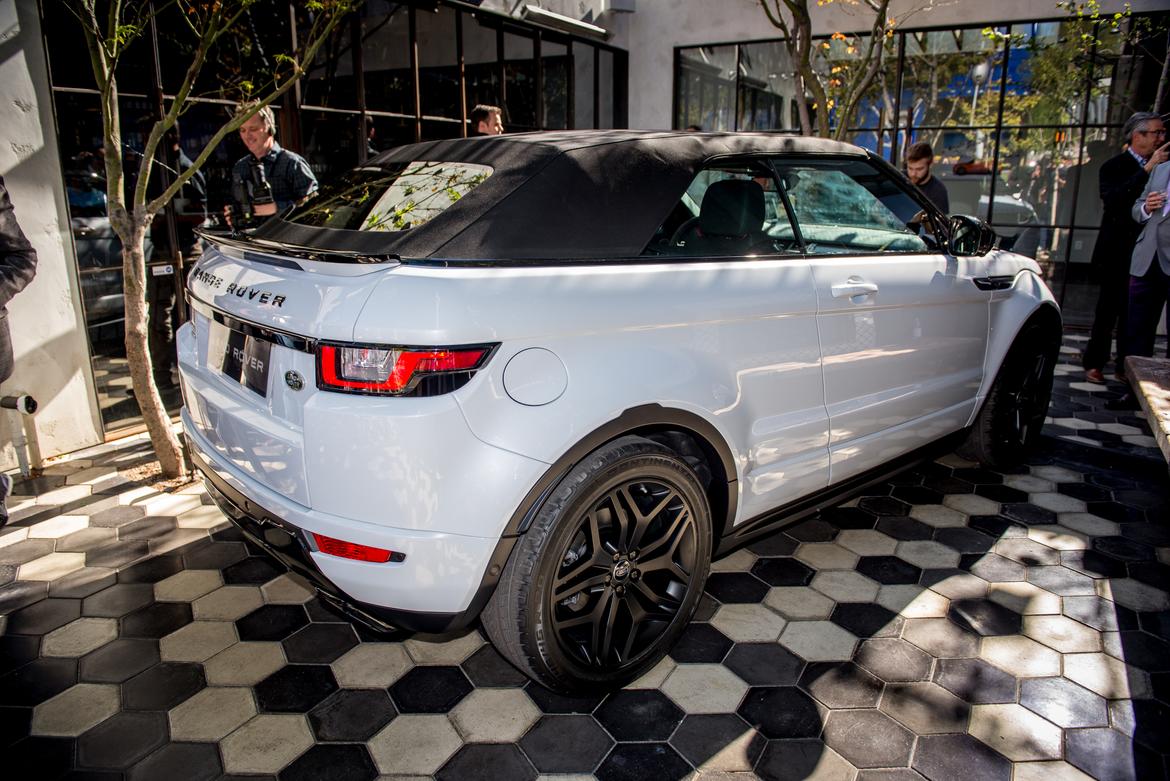
2017 Land Rover Range Rover Evoque Convertible; Cars.com photo by Steven Pham
AB: Loser
This thing is just dumb. Who looks at a nice compact SUV and says "Y' know what this needs? Less utility." There's no legroom at all in the backseat, the trunk opening is tiny and it just looks odd with its super-high sills and sitting-on-the-floor seating position. It's amusing to watch people sit in it and look out — their chins are almost at the same level as the bottom of the windows. And starting north of $50,000, well … Land Rover picked the right town to unveil it in, didn't it?
JB: Winner
The Evoque convertible is wonderfully weird. Who really needs a convertible that can wade through a shallow river? I don't know, but I like that Land Rover pitched the crazy concept and stuck with it through production.
JW: Winner
Remember those big convertibles of the past? Not the Nissan CrossCabriolet — the ones of the 1950s, '60s and '70s? They're gone. For that matter, so are many of the regular midsize convertibles with four or five seats. We need a big convertible, and the Evoque does the job. It doesn't look so great with the top up, but that's sadly common. I like the Evoque and I love convertibles. My approval isn't more sophisticated than that, but I'm comfortable with it.
MH: Winner
Unlike the Murano-based Nissan CrossCabriolet, the Evoque has gracefully made the transition from crossover to convertible. Who knows if that gives it more staying power in the market (the CrossCabriolet was short-lived), but the cachet the Range Rover name has garnered in the luxury segment should help.
2017 Lincoln MKZ
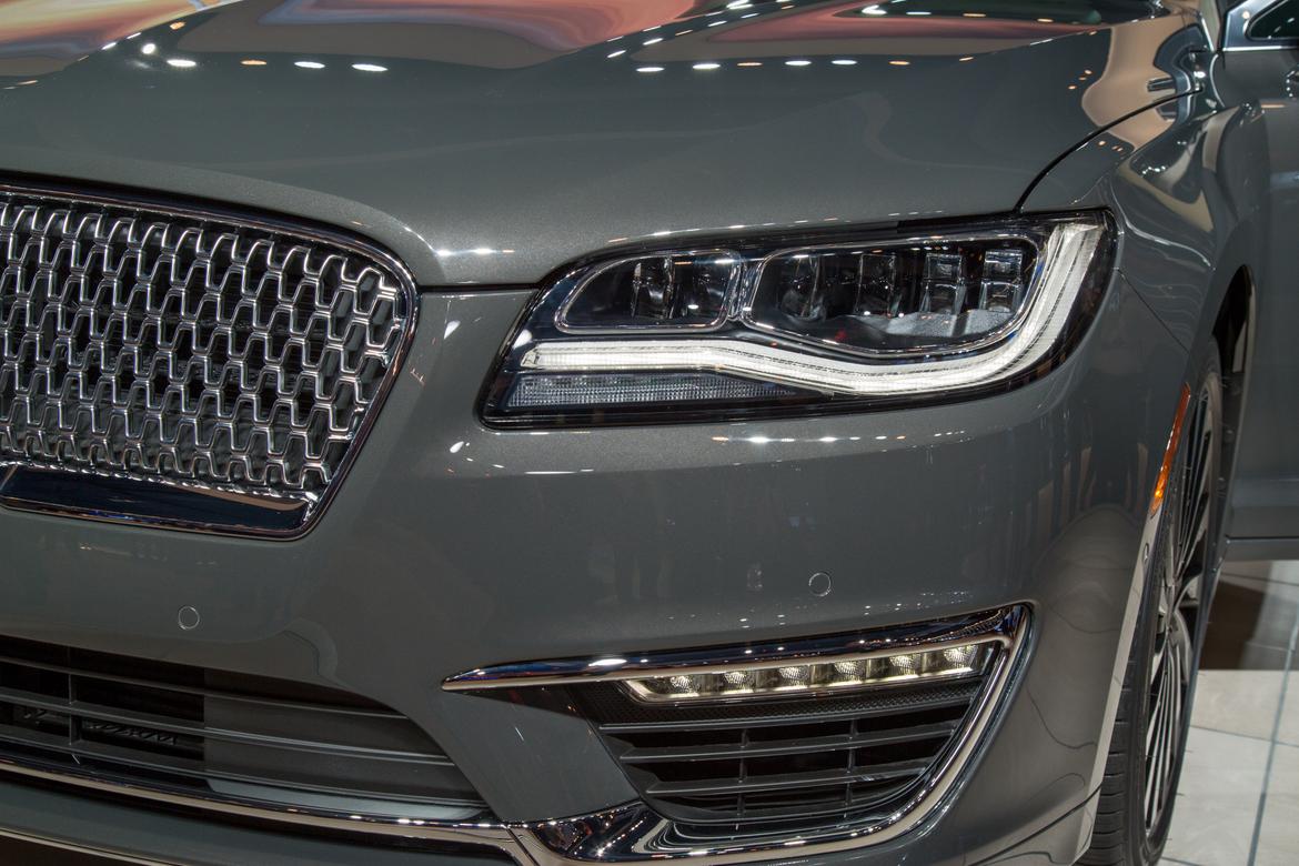
2017 Lincoln MKZ; Cars.com photo by Angela Conners
AB: Loser
Big props for ditching the touch-pads in exchange for real buttons and for dropping in a Lincoln-exclusive twin-turbo 3.0-liter engine, but what Lincoln did with the front-end restyle is not an improvement. Making it look like the Continental doesn't strike me as a good idea considering the Continental concept was completely derivative and uninspired. Lincoln seems to be styling its cars for the conservative Chinese market — a trend I see happening with others, too (Cadillac). That disturbs me, as the Chinese like boring-looking cars.
JB: Winner
Lincoln's new front-end styling on the MKZ may be a blah update, but a few areas on the inside have been blasted with an upscale look, like the door panels, highly stylized seats and new physical controls that look and feel better, and are made of metal on the Black Label model shown in L.A. I don't think there are more supple and soft leather seats in any other car at the auto show this year.
JW: Luh-hoo Suh-her
Remember what I said about how ditching touch-sensitive panels earns an automatic win? I take it back. Fixing the grille (even if Lincoln hadn't made it look worse) is bandaging a scraped knee when the patient has a sucking chest wound. Luxury manufacturers can pepper their lineups with dolled-up versions of their lesser brand's models. Unfortunately, until there's a Continental, that describes Lincoln's entire lineup. The automaker needs to fix the real problem.
MH: Loser
Lincoln styling was finally beginning to find its way with models like the MKC crossover, but it's back to square one again. It only reinforces how adrift the brand is in the luxury segment, and overshadows improvements made to the MKZ's cabin. Wiesenfelder is right that Lincoln needs a completely unique offering — and it needs it fast.
2016 Mazda CX-9
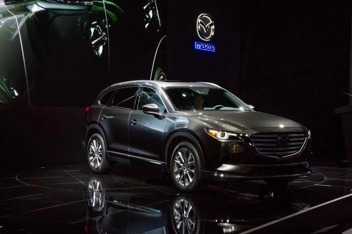
2016 Mazda CX-9; Cars.com photo by Angela Conners
AB: Winner
Mazda continues to knock 'em out of the park in the styling department, and the CX-9 is yet another example of doing it right. This Mazda may actually not be underpowered, thanks to a torquey turbocharged engine motivating things and weight that's down 200 to 300 pounds from the previous generation. It looks good inside, too; a great update.
JB: Winner
If there was ever an SUV in need of an update, it's the aging Mazda CX-9. The 2016 CX-9 over-delivers with not only a stunning design but a gorgeous interior (are they sure this is a Mazda?) as well as the new powertrain and lighter-weight underpinnings.
JW: Winner
This really rounds out the Mazda lineup nicely. Believe it or not, when the CX-9 came out essentially 10 years ago it was fun to drive in the context of big family haulers. Since then, the entire market has changed, leaving the 2015 feeling like a three-row boat anchor. The weight loss should help that as well as its currently unimpressive gas mileage.
MH: Winner
The sporty, athletic design sets the new CX-9 apart from many of its three-row competitors, and the cabin showcases just how nice high-end trim levels will be. Its design precludes it from winning any cargo-hauling contests, but for families that don't need maximum storage space, it looks mighty appealing.
2017 Mercedes-Benz SL-Class
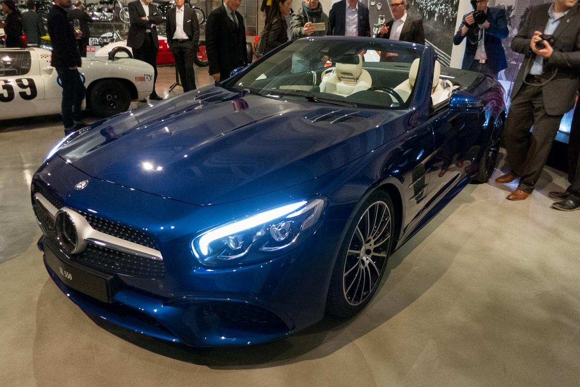
2017 Mercedes-Benz SL-Class; Cars.com photo by Aaron Bragman
AB: Winner
The last SL I drove was an SL65 AMG on a road trip from Detroit to St. Louis, and back, and I couldn't help thinking that it was a beautiful car to drive, but less so to behold. It looked angry and unhappy, like it wanted to eat your children. The new SL, however, smooths all that out by taking its front-end cues from the gorgeous Mercedes-AMG GT. It'll do until the SL can get a more complete makeover in a few years.
JB: Loser
This was worthy of an auto show introduction? The SL is a fantastic roadster and an Apple CarPlay update is great, but there's still much of the "old" Mercedes interior in how you interact with the climate, media and car functions.
JW: Loser
I'm with Bruzer on this one. I tried to get excited about the exterior tweaks, but in the end it was forgettable.
MH: Loser
The exterior styling updates improve the SL's appearance but I, too, had a hard time getting excited about this debut. It's also a bit baffling that Mercedes would put some of its ricketiest climate control dials in its flagship convertible, but there they are.
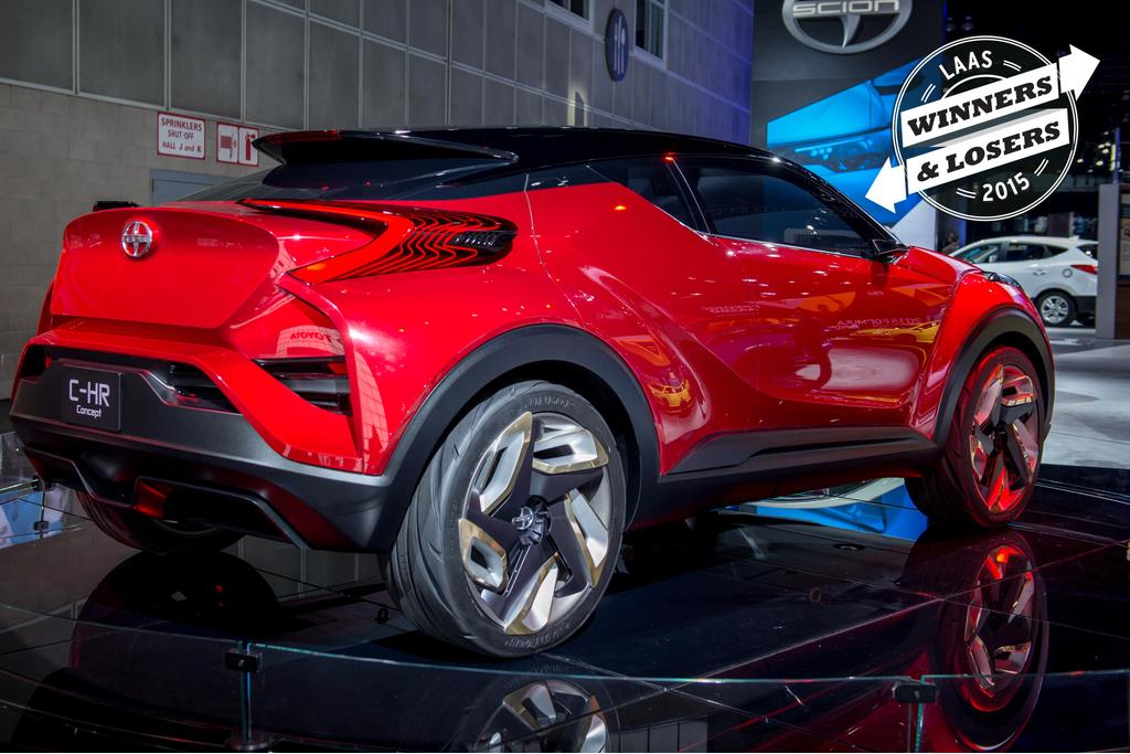
Scion CH-R Concept
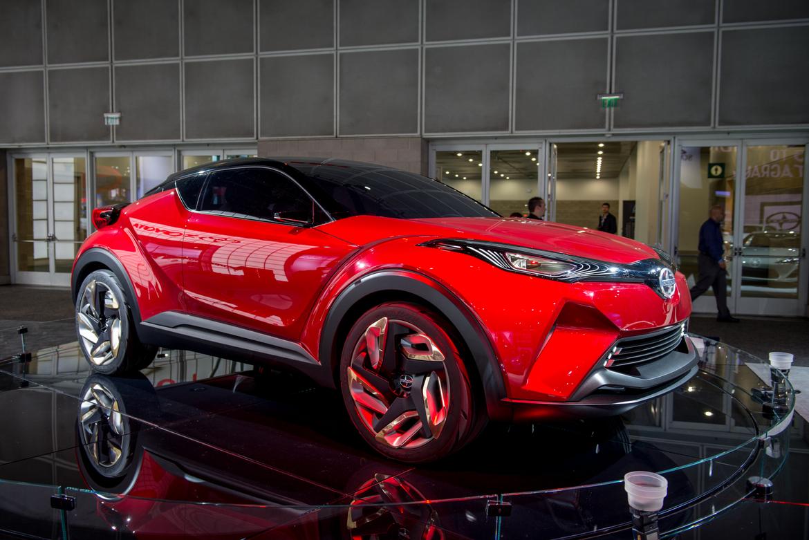
Scion CH-R Concept; Cars.com photo by Steven Pham
AB: Loser
So Scion made itself a Nissan Juke? Why? Or given Scion's new propensity for getting its vehicles from other automakers (like the Mazda-based iA), is it actually a Juke?
JB: Loser
Scion seems like the perfect fit for a youth-oriented subcompact SUV, but I'm not entirely sure what I'm looking at in the C-HR concept. I'm fairly confident the intended production version won't look anything like what's onstage.
JW: Winner
This is soooooo much better looking than a Nissan Juke. It will never be built this way (and it certainly shouldn't be), but in an auto show that's short on concept cars, it's neat to look at. The loser here is Toyota, a onetime small-car leader and arguable father of the crossover SUV that has allowed competitors to flood the market with subcompacts and done nothing but produce this concept.
MH: Winner
Pure concepts like the C-HR seem to be getting rarer and rarer, which makes its presence at the auto show a treat. Scion absolutely needs a crossover to add to its car-centric lineup, and when I squint at the C-HR's profile I can see a legitimate small crossover hiding in there.
Subaru Impreza Sedan Concept
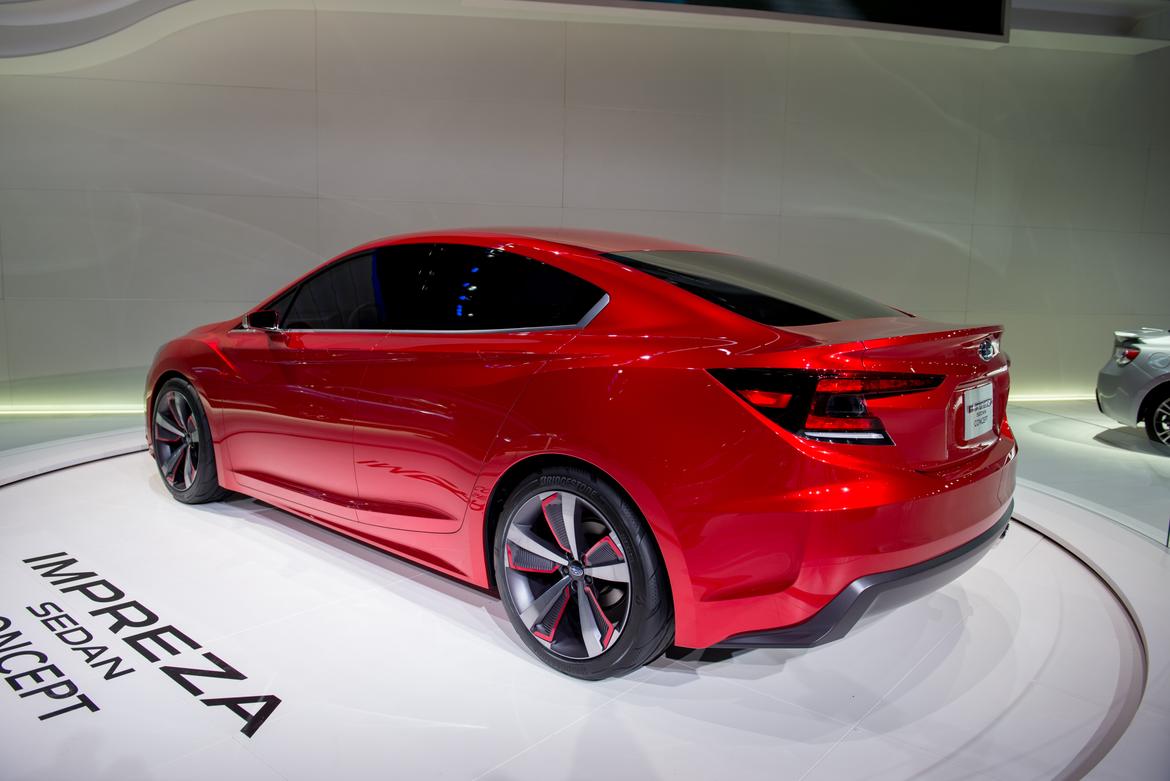
Subaru Impreza Sedan Concept; Cars.com photo by Steven Pham
AB: Loser
I'll not be taken in by you anymore, Subaru. The Impreza Sedan Concept looks great — but who cares? Every concept Subaru looks great. The production version won't look like this; it'll be toned down and turned into something boring and disappointing (just like Subaru did with the last Impreza "concept" we saw in New York a couple years ago). Fool me once, shame on you, fool me twice — well, I'm just not playing this game anymore.
JB: Loser
Subaru's biggest mistake with its concepts is saying they're an "Impreza" or "Legacy," which gives the expectation that some part of the design will make it to production. It never does, so perhaps next time Subaru introduces an amazing concept with no plans for the production version to look anything like the concept it should simply call it the "SXV-200L."
JW: Loser
Astute observation by Bruzek. I put Subaru on notice in 2013 when I named the Legacy Concept a winner with due skepticism. Those days are over. Nice to admire at an auto show, but if you expect it to go beyond that, you're going to be disappointed.
MH: Winner
The guys are right: If Subaru's history with concepts is anything to go by the next Impreza won't look nearly this sleek. Maybe we'll get the grille. However, it did look good under the auto show lights, and that's more than I can say for some concepts.
No comments:
Post a Comment